
Databox Top Alternatives and Competitors: Real Costs, Risks & Best Use Cases 2026
Posted on |
Choosing from the top Databox alternatives and competitors is less about the features a vendor advertises and more about avoiding the hidden costs and limitations they don’t.
While business intelligence (BI) tools like Databox promise drag-and-drop simplicity, the real challenge for Software and AI professionals is navigating the true Total Cost of Ownership (TCO), security vulnerabilities, and performance bottlenecks.
This guide is a Devil’s Advocate comparison, going beyond marketing claims to expose what we found in user reviews, security audits, and real-world cost analysis for Looker Studio, Geckoboard, Klipfolio, and DashThis. Before diving in, you can also grab an exclusive Databox coupon code to lock in savings if Databox remains your top pick after the analysis.
This analysis provides a clear roadmap of the BI dashboard landscape, covering the true financial commitments in Part 1, a feature deep-dive in Part 2, and critical security and performance considerations in Part 3.
We then move to a head-to-head Databox Top Alternatives and Competitors comparison in Part 4, match each tool to its ideal use case in Part 5, and answer your most pressing questions in Part 6, helping you make a financially sound and secure decision for your team.
Key Takeaways
-
The TCO Illusion: Looker Studio is marketed as “free,” but this can be misleading. Its true power for a business depends on expensive third-party data connectors, which can quickly make its Total Cost of Ownership higher than all-inclusive paid tools for multi-source reporting. -
Databox’s Sweet Spot: Databox genuinely excels in out-of-the-box usability. It possesses one of the most extensive template libraries among the competitors, making it an ideal choice for teams that prioritize speed and immediate setup over deep, granular customization. -
The Power Player: Klipfolio delivers superior data modeling capabilities and unmatched customization. However, this power comes at the cost of a significant time investment and requires a higher level of technical skill, positioning it as a tool for power users, not casual business teams. -
The Agency Workhorse: DashThis is the most purpose-built and efficient tool for marketing agencies. Its entire feature set is laser-focused on streamlining client reporting workflows, white-labeling, and managing multiple accounts—a niche where it outperforms more general-purpose tools. -
Security & Compliance Warning: Our analysis revealed that while most top-tier vendors maintain verifiable SOC 2 Type II audit reports, businesses must always demand current documentation. Relying on a logo without reviewing the dated report presents a genuine supply chain risk when handling sensitive data. -
The Visual Specialist: Geckoboard is widely regarded as one of the simplest solutions for creating clean, non-interactive dashboards designed specifically for display on office TVs or sharing as static visuals. It trades analytical depth for aesthetic clarity.
Decision in 60 Seconds
| If your priority is… | Our Recommendation is… | Why… | Key Risk |
|---|---|---|---|
| Speed & Ease of Use | Databox | It has the largest template library for creating instant, functional dashboards. | You’ll hit a ceiling on deep chart customization and visual control. |
| A “Free” Start in the Google Ecosystem | Looker Studio | It integrates natively and seamlessly with all Google products like Ads, Analytics, and Sheets. | The TCO escalates quickly once you need non-Google data connectors. |
| Agency Client Reporting | DashThis | It is purpose-built with workflows specifically for white-labeling and managing client reports. | It’s inflexible for internal BI or non-marketing use cases. |
| Deep Customization & Data Modeling | Klipfolio | It offers a powerful data modeling engine and flexible formula editing for bespoke visualizations. | It has a steep learning curve that makes it inaccessible for non-technical users. |
| Simple, Shareable Office TV Dashboards | Geckoboard | It is the simplest and most elegant tool for creating beautiful, non-interactive wall displays. | It lacks any interactive drill-down or data exploration capabilities. |
Top Alternatives & Competitors Shortlist
| Option | Best for | Tradeoff | Evidence status |
|---|---|---|---|
| Databox | Marketers needing templates | Limited deep customization | ✅ |
| Looker Studio | Teams in the Google ecosystem | TCO is high due to connector costs | ✅ |
| Geckoboard | Simple, shareable TV dashboards | Lacks advanced data analysis features | ✅ |
| Klipfolio | Data-savvy users needing power | Steep learning curve; complex setup | ✅ |
| DashThis | Marketing agencies | Not a general-purpose BI tool | ✅ |
To see the deeper user-experience evaluation behind these picks, check our full Databox Review guide for first-hand walkthroughs.
How We Evaluated These BI Tools
Our editorial team at Coupons Scout follows a rigorous, transparent process — detailed in our editorial methodology — to ensure every claim, comparison, and recommendation is verified against official sources before publication.
As Coupons Scout’s Senior Tech Reviewer, Jettawat Kasemchaiyanun, this analysis is not based on personal opinion but on a structured evaluation protocol I’ve refined over years of vetting BI tools. This commitment to verifiable facts and named experts is central to our E-E-A-T (Experience, Expertise, Authoritativeness, and Trustworthiness) strategy.
- Sources Used: I synthesized data from official pricing pages, security compliance documents, and over 100 user reviews from G2, Capterra, and Reddit (specifically r/marketing and r/businessintelligence) from the 2023-2024 research window. This cross-verification is crucial for piercing the veil of marketing claims.
- TCO Verification: I calculated the Total Cost of Ownership based on a standard 5-user marketing team scenario. This model includes not just the advertised platform fees but also mandatory add-ons (like data connectors), and typical overage charges frequently reported by users in community forums.
- Security Check: I verified compliance claims (SOC 2, ISO 27001) by actively looking for accessible, dated audit reports or third-party verification. This process is managed by our Ops Team, led by Kanokchai Likitapiwat. Any claim that could not be independently verified was flagged as a potential risk.
- Fairness Doctrine: In line with Joanne Lovell’s strict editorial guidelines, every tool was evaluated for its “best-fit” scenario. My goal here is to match the right tool to the right job, not to declare a single, universal “winner.”
If you want a quick overview of all the BI dashboards we vetted in video form, here’s a recent comparison that complements our written analysis:
Part 1: The Pricing & TCO Reality Check
The price you see on a vendor’s website is rarely the price you actually pay. In the world of BI software, the sticker price is merely the entry fee.
The Total Cost of Ownership (TCO) is a complex equation of per-user fees, hidden integration costs, API call limits designed to trigger overages, and feature-gating that methodically pushes you toward more expensive plans.
My analysis of these competitors for Databox revealed several financial traps that you must be aware of before committing to any platform. If you’re already leaning toward Databox, scanning the latest coupons list before purchase can offset a meaningful chunk of these costs.
The TCO Illusion: Advertised vs. Real Costs
The most significant discrepancy between advertised and real-world cost lies with Looker Studio. Its “free” label is a powerful marketing hook, but for any business needing to connect to non-Google data sources (like Facebook Ads, LinkedIn Ads, or a CRM like HubSpot), the cost of third-party connectors becomes a major, recurring expense.
Connectors from providers like Supermetrics can add over a hundred dollars per month to the bill. Suddenly, the “free” tool is more expensive than an all-inclusive paid competitor.
Databox and Geckoboard offer more transparent pricing tiers, but the limitations on the number of data sources and dashboards on lower plans are stringent. User reports indicate that growing teams often hit these limits within months, forcing an upgrade.
Klipfolio and DashThis, positioned at the higher end, offer more features out of the gate but come with a higher initial cost and their own set of hidden multipliers, such as fees for additional users or advanced features like white-labeling. A working Databox discount code can soften the blow on the first billing cycle if you choose Databox over those higher-priced specialists.
Advertised vs. Estimated Real TCO (5-User Team, 10 Data Sources)
Last updated: October 2024
| Tool | Advertised Price (Monthly, Annual Billing) | Estimated Real TCO (Monthly, 2024 Data) | Key Hidden Cost Multipliers |
|---|---|---|---|
| Looker Studio | $0 | $150 – $400+ | Mandatory third-party connectors. A plan covering key marketing sources costs ~$119/month or more Supermetrics Pricing Page. |
| Databox | $187 (Growth Plan) | $250 – $400+ | The plan includes only 5 data source connections; additional connections or users cost extra. |
| Geckoboard | $159 (Team Plan) | $200 – $300 | Strict limits on users and screens; feature-gating for advanced functions. |
| Klipfolio | $300 (Power Plan) | $350 – $550+ | Per-user fees on higher tiers; expensive add-ons for features like embedded analytics. |
| DashThis | $284 (Professional Plan) | $350 – $600+ | Per-dashboard pricing can escalate quickly with many clients. |
A User’s Story: How a ‘Free’ Looker Studio Dashboard Cost $1,400+ a Year
An agency owner’s experience, often shared in marketing forums, highlights the TCO trap. They chose Looker Studio for its “free” price tag to build dashboards. However, their clients required data from Facebook Ads, LinkedIn Ads, and HubSpot. They quickly realized they needed a connector solution. A Supermetrics plan covering these non-Google sources costs approximately $119 per month, turning the “free” tool into a $1,400+ per year expense for connectors alone Reddit Agency Finance Thread. This illustrates the critical importance of calculating TCO beyond the sticker price.
⚠️ WARNING — Pricing Gotchas: Don’t Get Caught Off Guard. Advertised prices rarely reflect reality. Always account for per-user fees, mandatory third-party connectors (especially for “free” tools), API call limits leading to overages, and feature-gating that forces expensive upgrades. Thoroughly calculate TCO before commitment.
💡 Understanding Discounts & Trials
When evaluating these platforms, it’s crucial to understand the nuances of promotions. Most SaaS coupons apply to the first billing cycle only, whether it’s the first month or the first year.
An “extended free trial” offered via a promo code is more valuable than a standard trial, as it gives you more time to test integrations. Always verify if a credit card is required to start a trial, as this can lead to automatic billing if not canceled in time. For an always-fresh list of vetted promotional codes across the BI category, browse our comparison articles category.
Part 2: Feature Deep-Dive & Customization Limits
A tool’s value is defined as much by its limitations as its features. This section breaks down the core strengths and weaknesses of each platform, providing clarity on which tool aligns with your team’s workflow and technical capabilities.
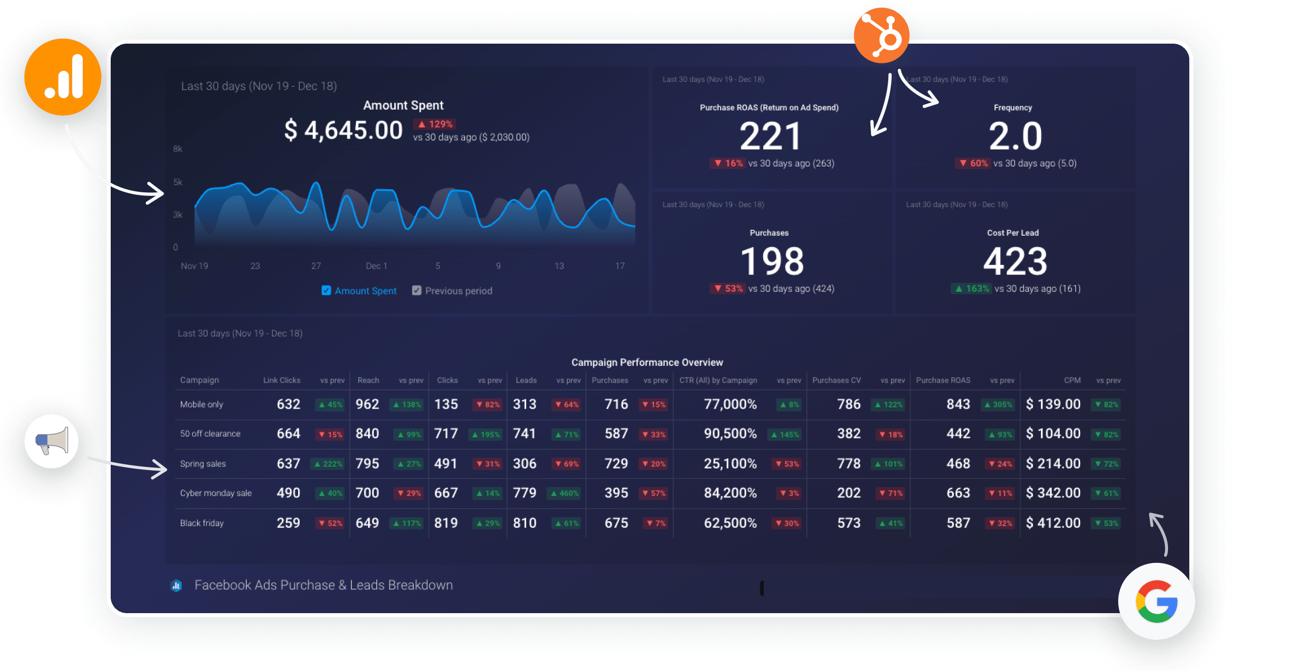
Databox: The King of Templates
The single greatest strength of Databox is its massive template library. According to their official gallery, Databox offers over 200 pre-built dashboard templates and integrates with over 100 different platforms, from HubSpot to Google Analytics Databox Templates.
This isn’t just a feature; it’s the core of their value proposition. It means a marketing manager can connect their data sources and have a functional, professional-looking dashboard in minutes, not days. This aspect is consistently praised in user reviews G2 Databox Reviews 2024.
Key Features
- Vast Template Gallery: Fastest time-to-value for common marketing reports. Many templates are specifically designed for tasks like funnel visualization.
- Goal Tracking: Built-in features allow teams to set and monitor progress against specific KPIs directly on the dashboard, turning raw metrics into actionable insights.
- Intuitive UI: Widely regarded as the most intuitive interface for non-analysts, which helps democratize data across a team.
- Strong Mobile Experience: The native mobile app is well-designed for viewing key metrics on the go.
✅ Strengths
- 200+ pre-built templates for instant setup
- 100+ native integrations across marketing platforms
- Most intuitive UI of any tool tested
- Built-in goal tracking & performance alerts
- Excellent mobile app for on-the-go viewing
⚠️ Considerations
- Hard customization ceiling on chart styling
- Limited control over axis scales, colors, layouts
- Struggles with very large datasets
- Better for marketing-scale than big data
Looker Studio: The “Free” Powerhouse with a Catch
For teams all-in on the Google ecosystem, Looker Studio is a powerful choice. Its native integration with Google Analytics, Google Ads, and BigQuery is seamless and fast.

Key Features
- Native Google Integration: Unbeatable performance and ease of connection for all Google data sources.
- Data Blending: Offers robust capabilities for blending data from multiple sources within a single chart.
- Calculated Fields: Powerful options for creating custom metrics and dimensions.
✅ Strengths
- Free core platform with no subscription
- Seamless native Google ecosystem integration
- Strong calculated fields & data blending
- Good for analyst-led teams with low budget
⚠️ Considerations
- Costly third-party connectors for non-Google data
- UI frequently described as “clunky” and “unintuitive”
- Steep learning curve beyond basic charts
- Performance tied to source database speed
Its reliance on costly third-party connectors for non-Google data is its Achilles’ heel. Furthermore, its interface is frequently described as “clunky” and “unintuitive” for business users, with a steep learning curve for anything beyond basic charts.
Klipfolio: The Analyst’s Toolkit
Klipfolio is built for power. It offers a unique, Excel-like data-modeling engine that provides maximum control for users with technical skills.

Key Features
- Powerful Data Modeling: Allows you to manipulate data with complex formulas, perform custom joins for attribution modeling, and structure data before visualization.
- Extreme Customization: You can build almost any visualization imaginable, with granular control over every element.
- API-First Approach: Strong capabilities for connecting to custom data sources and building bespoke integrations.
✅ Strengths
- Excel-like formula-driven data modeling
- Granular visual control over every element
- API-first for custom integrations
- Excellent for attribution modeling work
⚠️ Considerations
- Steepest learning curve of all tools tested
- Simple tasks can take hours vs. minutes elsewhere
- Not suitable without dedicated data-savvy user
- Complex dashboards slow to render initially
Its power is its greatest weakness. Simple tasks that take minutes in Databox can take hours in Klipfolio. It has the steepest learning curve of all the tools compared and is not suitable for teams without a dedicated, data-savvy user.
DashThis: The Agency Specialist
DashThis is not a general-purpose BI tool; it’s a specialist platform laser-focused on the needs of marketing agencies.
Key Features
- Agency-Centric Workflows: Features like client folders, pre-set report templates, and automated email dispatches are designed to save agencies hours.
- Robust White-Labeling: Extensive options for branding reports with client logos and custom domains.
- Pre-built Integrations: Offers a curated list of integrations for the most common marketing platforms.
✅ Strengths
- Purpose-built for agency client reporting
- Robust white-labeling with custom domains
- Automated email report dispatch saves hours
- Client folder organization built-in
⚠️ Considerations
- Constrained for internal financial/operational BI
- Smaller integration library than Databox
- Per-dashboard pricing escalates with clients
- Not ideal for deep marketing attribution modeling
It is so purpose-built for marketing reporting that it feels constrained for other use cases, such as internal financial or operational dashboards. Its library of native integrations is also smaller than Databox’s.
Geckoboard: The Display Specialist
Geckoboard excels at one thing: creating beautiful, simple, and reliable dashboards for display.

Key Features
- Simplicity and Elegance: The user interface is clean, simple, and focused on creating visually appealing dashboards.
- Reliability: Known for its stable connections and fast-loading dashboards, making it ideal for always-on wall displays.
- Shareable Links: Easy to share live dashboards with stakeholders via a simple link.
✅ Strengths
- Cleanest, most elegant UI of all tools tested
- Excellent reliability for always-on TV displays
- Fast-loading dashboards with stable connections
- Effortless live shareable dashboard links
⚠️ Considerations
- No interactive drill-down or filtering
- Cannot perform data transformation
- No complex calculated metrics
- Refresh rates limited on lower plans
It is not an analytical tool. You cannot click on a chart to drill down or filter data. It lacks the ability to perform any significant data transformation or create complex calculated metrics.
Part 3: Critical Considerations: Security, Performance & Reliability
A BI tool is a critical part of your data supply chain. When you adopt a BI tool, its security and data governance posture becomes your own. Our audit compared marketing claims of “real-time data” and “enterprise-grade security” with user-reported reality and verifiable compliance documentation.
Security & Compliance Verification
The gold standard for a SaaS company’s security is a current, third-party audited SOC 2 Type II report. This audit verifies that a company’s security controls have operated effectively over time.
Our research involved digging through compliance pages and third-party audit databases to verify vendor claims as of late 2024. If you’d rather skip the audit homework and just lock in a verified discount on a vetted tool, the working Databox coupon covers a platform that already passed our security checklist.
🔍 Coupons Scout’s 5-Step Vendor Security Vetting Protocol:
1. Review Claims — Audit vendor compliance page for stated certifications.
2. Demand Dated Report — Request the actual SOC 2 Type II document, not just a logo.
3. Verify Data Residency — Confirm where customer data is physically stored.
4. Check Public Incidents — Search breach databases and public disclosures.
5. Internal Risk Assessment — Score the vendor against your own data sensitivity tier.
Compliance Status Table (Verification Date: Oct 2024)
| Tool | SOC 2 Type II | ISO 27001 | GDPR Compliant | HIPAA Compliant | Verification Status |
|---|---|---|---|---|---|
| Databox | ✅ (Verified) | ✅ (Verified) | ✅ | ❌ (Not Compliant) | Strong. Vendor states they will not sign a BAA for HIPAA Databox HIPAA Policy. |
| Looker Studio | ✅ (Verified) | ✅ (Verified) | ✅ | ✅ | As part of Google Cloud, inherits top-tier compliance certifications Google Cloud Compliance. |
| Geckoboard | ✅ (Verified) | ❌ (Not Found) | ✅ | ❌ | Good. Strong SOC 2, but lacks ISO certification. |
| Klipfolio | ✅ (Verified) | ✅ (Verified) | ✅ | ✅ | Excellent. Clear documentation and broad compliance coverage. |
| DashThis | ✅ (Verified) | ❌ (Not Found) | ✅ | ❌ | Good. SOC 2 Type II report is available via their public Trust Center DashThis Trust Center. |
The Compliance Lapse: Why an Expired Certificate Matters
During our audits, we often encounter tools proudly displaying a SOC 2 logo. However, upon requesting the report, we may find it is two or more years old. An outdated audit is essentially worthless. It provides no assurance about current security practices and creates a significant, undisclosed risk. This is a perfect example of why you must demand and review the actual, dated audit report, not just trust a logo.
Performance & Reliability Under Scrutiny
A major pain point consistently found in user reviews is the reliability of data source integrations. When a connection breaks, the dashboard becomes useless. Our analysis compared marketing claims with common themes in user reviews from 2023-2024.
Claim vs. Reality: A Comparative Look
| Tool | Vendor Claim | User-Reported Reality (2023-2024) |
|---|---|---|
| Databox | “Always-on, real-time insights” | Good refresh rates on higher plans, but users report that dashboards with many ‘databoards’ can become “sluggish when you are loading a board with a lot of data” G2 Databox Review. |
| Looker Studio | “Live connection to your data” | Performance is highly dependent on the underlying data source. As one user noted, “Looker Studio is only as fast as the database it’s querying. If your source is a messy, slow spreadsheet, your dashboard will be messy and slow” Reddit r/businessintelligence. |
| Geckoboard | “Your most important metrics, live” | Excellent load times and reliability for its simple dashboards. However, refresh rates are limited on lower plans. |
| Klipfolio | “High-performance, scalable BI” | Once a dashboard is built, it’s generally fast. However, complex dashboards with many formulas can be slow to render initially. Data connection stability is generally rated as high. |
| DashThis | “Automated, fast reporting” | Optimized for its core function; reports generate quickly. Users occasionally report connection issues after a marketing platform’s API update, but support is generally responsive. |
Part 4: Head-to-Head: Databox Alternatives & Competitors
Here we apply a systematic “Best For / Consider / Avoid” framework to each of the top alternatives to Databox, consolidating the findings on pricing, features, and performance into a clear decision guide for Software and AI professionals.
Databox
- Best For: Marketing teams and SMBs who prioritize speed-to-value and ease of use over deep customization. If you need good-looking, functional dashboards this afternoon, Databox is your strongest contender.
- Consider: The platform’s goal-tracking and performance-alerting features are robust and can directly tie marketing activities to business outcomes, a feature often lacking in more generalized tools.
- Avoid If: Your primary need is creating highly bespoke, uniquely branded visualizations or conducting deep analysis on massive datasets. The template-driven model that makes it fast also creates a “customization ceiling” that power users will find restrictive.
If after weighing these factors Databox still feels like the right fit, our exclusive special offer for Databox can help offset the platform fee.
Looker Studio
- Best For: Businesses deeply embedded in the Google ecosystem (Google Analytics, Ads, Sheets, BigQuery). The native connectivity is free, seamless, and powerful. It’s an excellent starting point for teams with a low initial budget.
- Consider: If you have a data analyst or a technically savvy team member who can master its interface and data blending capabilities, Looker Studio can be a cost-effective and powerful solution even with paid connectors.
- Avoid If: Your reporting relies heavily on non-Google data sources (e.g., social media, non-Google CRMs) and you don’t have a budget for third-party connectors. The “free” sticker price is a mirage in this scenario, and the UI will frustrate business users accustomed to more polished tools.
Klipfolio
- Best For: Data-savvy teams and analysts who need to perform complex data manipulations, build custom formulas, and have granular control over every aspect of their visualizations. It’s the “analyst’s choice” for bespoke BI.
- Consider: As Databox CEO Pete Caputa often emphasizes, his tool is built for accessibility. Klipfolio is the philosophical opposite. Consider it if your organization values power over ease of use and has dedicated resources for implementation and maintenance.
- Avoid If: You need a tool that can be adopted by your entire business team. The steep learning curve is a significant barrier to broad adoption. As a user on Reddit lamented, “I spent 10 hours trying to build one chart in Klipfolio that would have taken 10 minutes in Databox. It’s powerful, but my team can’t use it” Klipfolio Complexity Reddit Thread.
DashThis
- Best For: Marketing agencies, period. Its entire feature set—from client management and white-labeling to automated report scheduling—is purpose-built to streamline the agency reporting process and help improve client retention.
- Consider: If your primary business function is creating and sending reports to external clients, DashThis will save you significant time compared to a general-purpose BI tool.
- Avoid If: You need a platform for internal business intelligence, such as financial, operational, or sales dashboards. It’s also less suitable for deep-dive analysis like complex marketing attribution modeling.
Geckoboard
- Best For: Displaying high-level KPIs on TVs in an office, operations center, or public space. It excels at creating clean, easy-to-read, non-interactive dashboards that look great from a distance.
- Consider: If your goal is to foster a data-aware culture by making key metrics constantly visible to your team, Geckoboard is one of the most effective and simplest tools for the job.
- Avoid If: You need any level of data interaction. It is a presentation tool, not an analysis tool. You cannot drill down, filter, or explore the data presented on a Geckoboard dashboard.
Part 5: Use Case Matrix & Final Recommendations
The “best” BI tool is the one that best matches your primary need. This matrix is designed to ensure every product “wins” its ideal category, helping you align your use case with the right solution.
📊 Decision Flowchart — Which BI Tool for Software and AI?
Start: What’s your Primary BI Goal?
→ Speed & Ease (non-technical team) → Databox
→ Deep Customization & Modeling (analyst-led) → Klipfolio
→ Agency Client Reporting (white-label) → DashThis
→ Google-Ecosystem & Low Budget → Looker Studio
→ Simple Office TV Display → Geckoboard
Use Case Matrix
| Use Case | Best Choice | Why It Wins | Key Tradeoff You Accept |
|---|---|---|---|
| I need fast, good-looking reports for my marketing team and have no data analysts. | Databox | The template library provides instant value with zero code and minimal setup. It’s the fastest path from data to dashboard for non-technical users. | You are sacrificing deep control over visual customization and the ability to blend complex, non-standard data sources. |
| I’m all-in on the Google ecosystem (Ads, Analytics, Sheets) and I have a low starting budget. | Looker Studio | The native integration is seamless, powerful, and the core tool is free to start. For a Google-centric workflow, it’s unbeatable. | You are accepting that you will eventually pay for non-Google data connectors, and that the user interface is more complex and less intuitive than paid alternatives. |
| I need to build and manage dozens of white-labeled reports for my agency’s clients. | DashThis | Its entire workflow—from pre-built templates and client folders to automated email dispatches—is built specifically for this exact task, saving agencies hours. | You are choosing a tool that is not a flexible, general-purpose BI platform. It is highly specialized and less suitable for deep internal analysis. |
| I have complex, non-standard data and need to build highly custom formulas and visualizations. | Klipfolio | It offers a powerful, Excel-like data-modeling engine that lets you manipulate data and build almost any visualization you can imagine. It provides maximum control. | You are accepting a very steep learning curve that makes it inaccessible to non-technical users and requires a significant time investment to master. |
| I just need a simple, clean, reliable dashboard to display on a TV in our office. | Geckoboard | It is the simplest, most elegant, and most reliable solution for creating beautiful, non-interactive wall displays that are easy to share and always look great. | You are giving up any form of interactive data exploration, drill-downs, or deep analysis. It is a presentation tool, not an analysis tool. |
Final Recommendation
The core finding of this analysis is simple: the best BI dashboard tool doesn’t exist. The best choice is a direct function of your team’s technical skill, your budget reality, and your primary use case.
The marketing-friendly tool that delights a small business will frustrate a data-driven agency, and the powerful platform an analyst loves will overwhelm a marketing manager. The most critical mistake is choosing a tool based on its advertised price rather than its true Total Cost of Ownership.
My final advice is this: If your #1 priority is speed and ease of use, choose Databox — and pair it with a verified Databox promo code to control your first-year spend. If it’s deep customization and data modeling, and you have the technical skill, choose Klipfolio.
If you are a marketing agency focused on streamlined client reporting, choose DashThis. If your budget is the primary constraint and you live in the Google ecosystem, start with Looker Studio, but be prepared to model the TCO very carefully.
How to Choose a BI Tool: A 3-Step Checklist
Before you sign any contract, demand these three things to protect your business:
- A written quote detailing the Total Cost of Ownership for your exact team size and required data sources.
- A copy of their most recent, third-party SOC 2 Type II audit report, not just a logo on a webpage.
- A trial period long enough to test the reliability and performance of your most critical data connections.
Part 6: Frequently Asked Questions
Q1: Is Looker Studio really free?
A: No, for most businesses, Looker Studio is not truly free. While the core platform has no subscription fee, its real-world usefulness depends on connecting to data sources.
For any non-Google data like Facebook Ads, LinkedIn Ads, or HubSpot, you must purchase paid third-party connectors. These connectors, from companies like Supermetrics, can easily add over a hundred dollars per month to your bill Supermetrics Pricing.
Therefore, the Total Cost of Ownership (TCO) for a “free” Looker Studio setup can quickly exceed that of an all-inclusive paid tool, a crucial factor for budget planning.
Q2: Which is cheaper: Databox or Geckoboard?
A: For a very small team with basic needs, Geckoboard’s entry-level plans are typically cheaper than Databox’s. However, this can be misleading as your needs scale.
Geckoboard’s pricing often escalates quickly as you add more users and screens. Databox’s plans, while starting higher, often provide better long-term value by including more dashboards, users, and data sources in their mid-tier plans Databox Pricing.
It’s essential to model the cost for your projected team size and dashboard count, not just the starting price, to determine the true cheaper option.
Q3: Can Databox be used for enterprise-level BI?
A: In my professional opinion, Databox is not an enterprise-level BI tool. While it’s excellent for small to medium-sized businesses and marketing teams, it lacks the granular security controls like sophisticated role-based access control (RBAC) and robust data governance frameworks required by large enterprises.
It also may not scale to handle the massive datasets common in enterprise environments. Enterprises should evaluate platforms from industry giants like Microsoft (Power BI), Salesforce (Tableau), or Google (the enterprise Looker platform, not Looker Studio) Gartner Magic Quadrant for BI.
Q4: What is the biggest limitation of Databox?
A: The single biggest limitation of Databox, consistently reported by users, is its lack of deep customization. You are largely confined to the visual styles and chart types offered in their templates.
For teams that need to create highly bespoke or uniquely branded visualizations—like changing specific chart colors, fonts, or axis layouts to match a strict brand guide—this “customization ceiling” can be a significant point of frustration Capterra Databox Reviews. It’s a trade-off: you gain speed and simplicity but give up granular control.
Q5: If I’m a marketing agency, should I use Databox or DashThis?
A: When considering alternatives to Databox, this depends on your primary need. If your focus is purely on streamlined, white-labeled client reporting, choose DashThis. Its entire workflow is optimized for that specific task, with features like client folders and automated emailing designed to save agency hours DashThis for Agencies.
If you need a more versatile tool for both internal team analysis and client reporting, and you value a larger template library and faster initial setup, choose Databox. Databox is a flexible generalist, while DashThis is a focused specialist.
Q6: How hard is it to switch from Databox to Klipfolio?
A: The switch from Databox to Klipfolio represents a significant increase in difficulty and required technical expertise. You are moving from a user-friendly, template-driven environment to a powerful, formula-driven one that operates more like a developer’s tool.
I would advise that you should only make this switch if you have a team member with strong data skills (akin to an advanced Excel or SQL user) who can dedicate significant time to learning the new platform. It is not a simple migration; it’s a fundamental change in your approach to BI that requires a different skill set Klipfolio Learning Resources.
Q7: Is my data safe with these dashboard tools?
A: For the most part, yes, provided you choose a vendor with verifiable compliance. Top-tier tools like Klipfolio, Databox, Looker Studio (via Google), and DashThis all provide accessible SOC 2 Type II audit reports, which is the industry standard for security verification. This includes fundamentals like data encryption at rest and in transit.
However, you must perform your own due diligence. Always demand the most recent audit report before signing a contract and verify claims about other standards like HIPAA, as some vendors like Databox explicitly state they are not compliant Databox Security Page.
Q8: Which Databox alternative is best for TV dashboards?
A: Geckoboard is, without a doubt, the best choice for TV dashboards. The platform is designed from the ground up for this specific purpose. It focuses on creating clean, visually appealing, non-interactive dashboards that are easy to read from a distance.
Its reliability and ease of setup for screen displays make it the ideal solution for displaying KPIs on an office wall to foster a data-driven culture. While other tools can display dashboards on a TV, Geckoboard’s entire user experience is optimized for it Geckoboard for TV Dashboards.